Date panel component for React
 Astrian Zheng
1eb59aa151
Astrian Zheng
1eb59aa151
All checks were successful
Publish to npm / publish (push) Successful in 29s
|
||
|---|---|---|
| .gitea/workflows | ||
| marketing_assets | ||
| playground | ||
| src | ||
| .gitignore | ||
| .npmignore | ||
| eslint.config.js | ||
| LICENSE | ||
| package-lock.json | ||
| package.json | ||
| README.md | ||
| tsconfig.app.json | ||
| tsconfig.json | ||
| tsconfig.node.json | ||
| vite.config.ts | ||
Datenel
Datenel = Date + Panel
Datenel is a web UI component for selecting dates. It provides a customizable date picker panel that can be easily integrated into your React applications.
Shadow border not included. Battery included.
A Vue.js-supported version is in development.
Features
- Zero runtime dependencies: Slim size with low to 14.26 kB, also flexible to your favorite time processing library.
- Customizable Colors: Easily change the main, accent, reversed, hover, and border colors of the panel.
- Localization: Supports localization for different languages.
- Accessibility: Includes features for screen readers and keyboard navigation.
- Programmatic Control: Control the selected date programmatically and handle date selection events.
- JSDoc Support: Full IDE prompt support to help you use Datenel more conveniently.
Installation
To install Datenel, use npm or yarn:
npm install datenel-react # Use npm
yarn add datenel-react # Use yarn
Usage
Here is an example of how to use Datenel in your React application:
import React from 'react'
import { SingleDatePicker } from 'datenel-react'

export default () => {
  function onSelect(value) {
    alert(`You selected ${value.year}-${value-month}-${value.day}`)
  }

  return (
    <div className='app'>
      <div className="border">
        <SingleDatePicker
          value={{
            year: 2025,
            month: 1,
            day: 1
          }}
          onSelect={onSelect}
        />
      </div>
    </div>
  )
}
Supported Components & Props
- SingleDatePicker
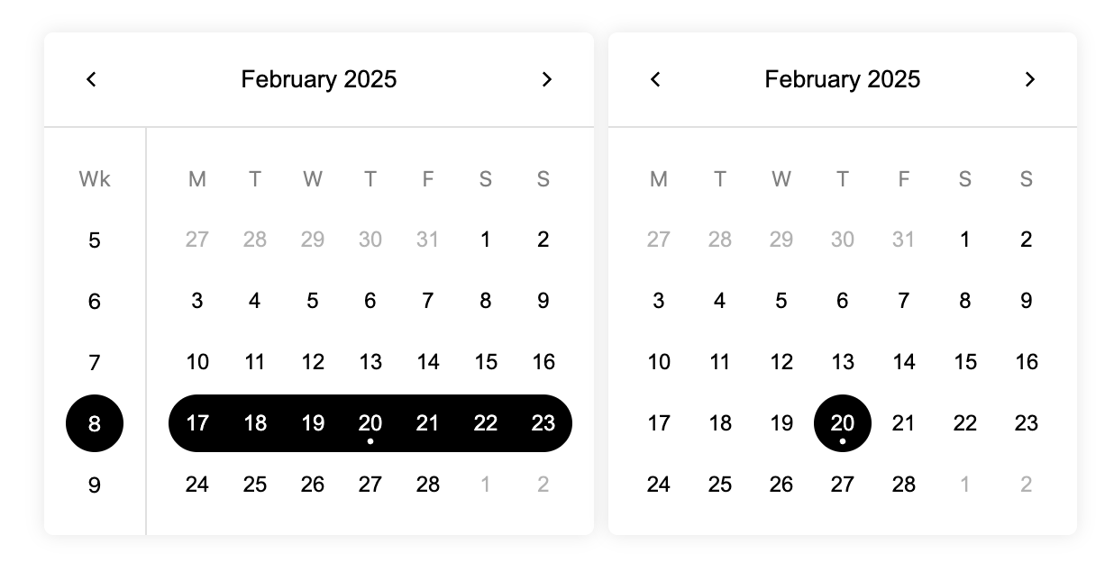
- SingleWeekPicker
- MultipleDatePicker
- DateRangePicker
More features are on the roadmap.
Contribution & Development
npm i # or `yarn`
npm run dev # or `yarn dev`
Then the package will launch a testing React hot-reload server on localhost:1926. The server file is available in the playground folder, feel free to modify the content inside it.
License
MIT