 Astrian Zheng
29318f8a8a
Astrian Zheng
29318f8a8a
All checks were successful
Publish to npm / publish (push) Successful in 26s
76 lines
2.1 KiB
Markdown
76 lines
2.1 KiB
Markdown
# Datenel
|
||
|
||
**Datenel = Date + Panel**
|
||
|
||
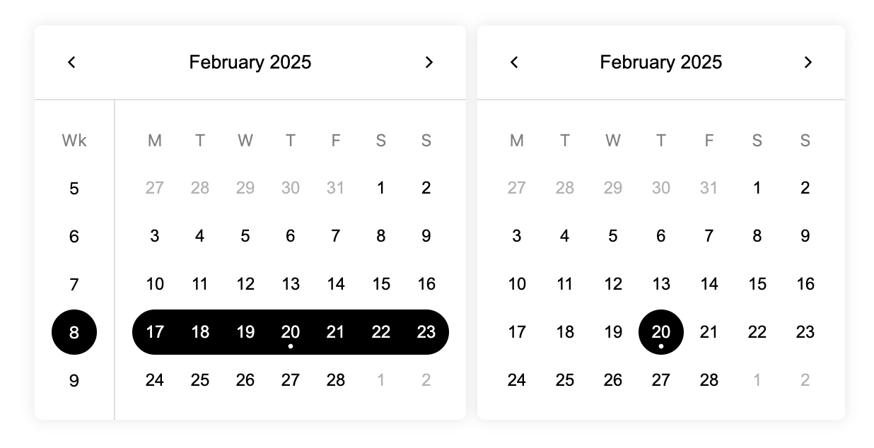
Datenel is a web UI component for selecting dates. It provides a customizable date picker panel that can be easily integrated into your React applications.
|
||
|
||
Want to use Datenel in Vue.js 3 application? [We got you](https://www.npmjs.com/package/datenel-vue3).
|
||
|
||
|
||
|
||
*Shadow border not included. Battery included.*
|
||
|
||
## Features
|
||
|
||
- **Zero runtime dependencies**: Slim size with low to 14.26 kB, also flexible to your favorite time processing library.
|
||
- **Customizable Colors**: Easily change the main, accent, reversed, hover, and border colors of the panel.
|
||
- **Localization**: Supports localization for different languages.
|
||
- **Accessibility**: Includes features for screen readers and keyboard navigation.
|
||
- **Programmatic Control**: Control the selected date programmatically and handle date selection events.
|
||
- **JSDoc Support**: Full IDE prompt support to help you use Datenel more conveniently.
|
||
|
||
## Installation
|
||
|
||
To install Datenel, use npm or yarn:
|
||
|
||
```sh
|
||
npm install datenel-react # Use npm
|
||
yarn add datenel-react # Use yarn
|
||
```
|
||
|
||
## Usage
|
||
|
||
Here is an example of how to use Datenel in your React application:
|
||
|
||
```tsx
|
||
import { SingleDatePicker } from 'datenel-react'
|
||
|
||
export default () => {
|
||
function onSelect(value) {
|
||
alert(`You selected ${value.year}-${value-month}-${value.day}`)
|
||
}
|
||
|
||
return <SingleDatePicker
|
||
value={{
|
||
year: 2025,
|
||
month: 1,
|
||
day: 1
|
||
}}
|
||
onSelect={onSelect}
|
||
/>
|
||
}
|
||
```
|
||
|
||
For more information and live demo, refer to [Datenel’s documentation](https://datenel.js.org/guide/react/gettingstart.html).
|
||
|
||
## Supported Components & Props
|
||
|
||
- [x] SingleDatePicker
|
||
- [x] SingleWeekPicker
|
||
- [ ] MultipleDatePicker
|
||
- [ ] DateRangePicker
|
||
|
||
More features are on the roadmap.
|
||
|
||
## Contribution & Development
|
||
|
||
```zsh
|
||
npm i # or `yarn`
|
||
npm run dev # or `yarn dev`
|
||
```
|
||
|
||
Then the package will launch a testing React hot-reload server on `localhost:1926`. The server file is available in the `playground` folder, feel free to modify the content inside it.
|
||
|
||
## License
|
||
|
||
MIT |